Case study · Enterprise
Genesis.
Streamlining HR and project management, one source of truth for a bank's technology workforce.

The challenge
DBS's technology division ran on two separate records. HR owned the people, headcount, roles, skills, and bench capacity. Delivery owned the work, project portfolios, milestones, and team allocation. Neither could see the other. Answering a basic leadership question, who is free to staff this, meant cross-referencing the two by hand across more than 20 departments.
The project
Genesis joins those two records into one source of truth. Not a new HR tool and not a new project tracker, but the layer between them, built so leadership can see people and work in the same place and resource on current data instead of a stale spreadsheet.
The data already existed. What was missing was a single place to see it together, and a structure more than 20 departments could agree on. Three gaps made that concrete.
No single view of the workforce
Headcount, roles, skills, and bench capacity lived across departmental spreadsheets. There was no reliable read on who was available, or where the gaps were.
No consolidated view of delivery
Project status, milestones, and allocation were tracked separately by each department. Leadership saw fragments, never the full portfolio at once.
No line of sight on delivery health
With people and work in different systems, there was no way to tell at a glance whether delivery was on track, or where resourcing was the risk.
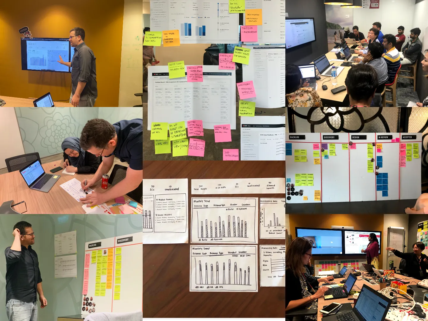
Across an eight to nine month engagement, discovery started with stakeholder interviews and workflow mapping over the technology and HR teams, tracing how workforce data was tracked, how portfolios were reported, and how leadership actually made resourcing calls.
The consistent finding was that no one needed more data. They needed the two records they already had, side by side, in a structure every department could read the same way.
Not every idea earned its place. A timeline view for portfolio key dates read well as a concept, but it carried too much build cost for the delivery pipeline, so it was dropped in favour of a simpler structure. On a platform this size, judging what not to ship mattered as much as the screens that made it.
Workforce, who we have
A unified view of headcount, roles, skills, and bench availability. Capacity and resourcing gaps became visible in one place instead of pieced together by hand each time the question came up.
Portfolio, what they're on
A consolidated portfolio view with status, milestones, and team allocation, replacing fragmented spreadsheets and manual reporting with one live list.
Dashboard, is delivery healthy
An executive dashboard surfacing delivery health, resourcing signals, and operational KPIs, structured for a quick scan rather than a deep read.
Navigation was the anchor
Genesis started with three stacked navigation bars. On a platform this layered, that meant users lost their place, especially inside the multi-level portfolio structure. Navigation was not a detail here, it set the experience of every screen, so it was the first thing to fix.
After testing several models, the platform settled on a cleaner global navigation plus a separate in-portfolio left navigation. The split did two jobs: it kept app-level and portfolio-level movement from being mistaken for each other, and it gave the portfolio hierarchy a place to live, so people always knew where they were and where a step would take them.
Designing the dense data, not decorating it
The dashboard and financials views carried the heaviest data on the platform, the kind of screens that fail quietly by showing everything and communicating nothing. The test they were held to was simple: a visualisation works when people ask better questions about the data, not about the chart.
That meant choosing forms deliberately, area charts for trends over time, columns for comparison, each kept to a readable number of series, and structuring the financial summary around how leaders actually read it, scenario against scenario, across monthly, quarterly, and yearly views.
Canopy was DBS's design system, but it had been built for customer-facing products. Genesis was one of the first internal platforms to adopt it, so part of the work was defining what the system needed to become for dense, data-heavy internal tools.
That happened in daily sessions with the design-system team: agreeing patterns, feeding CSS back as design tokens, and flagging where Canopy did not yet cover an internal need so new components could be added deliberately rather than improvised. The work handed off cleanly to a large, distributed engineering team, and left the system a little more ready for the internal apps that followed.
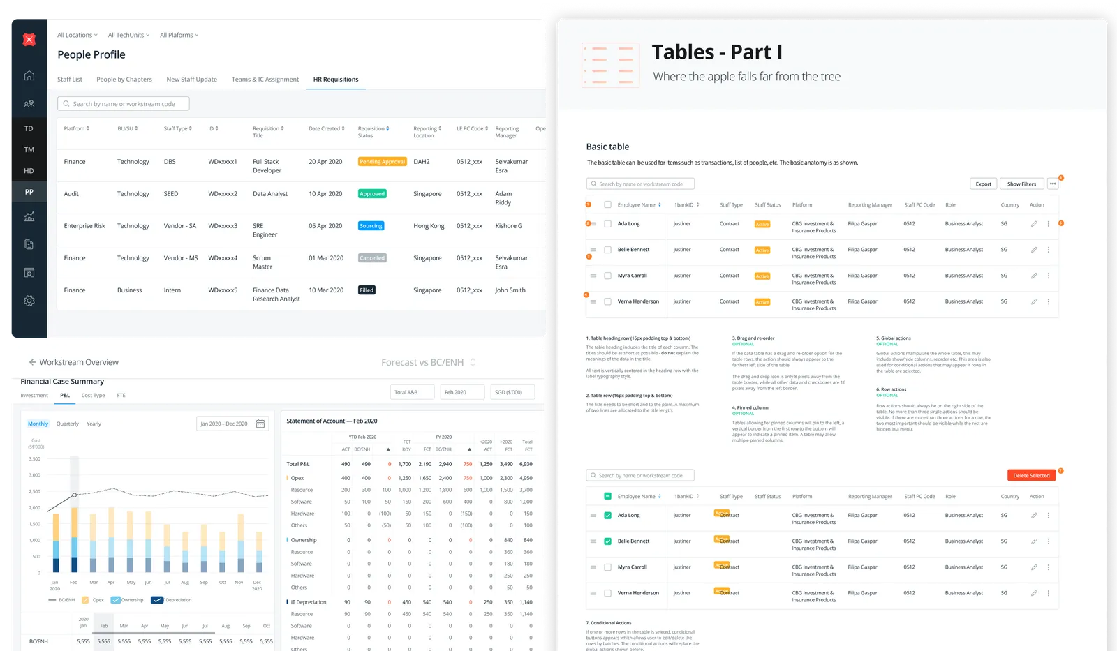
Aligning more than 20 departments was the hard part of Genesis, and it was earned in writing. Each week I prepared a journal for stakeholders: progress, visual updates, and the reasoning behind that week's decisions. Together they are the actual record of how the platform was thought through, not a reconstruction after the fact.
Genesis replaced manual reconciliation across 20+ departments with a single source of truth for resourcing and delivery tracking. The measure of the work was structural, people and work finally in the same view, on current data, so a resourcing decision no longer started by stitching the two records together by hand.
- Lead UIUX DesignerEnd-to-end platform design
- Stakeholder managementAlignment across 20+ departments
- Documentation leadScalable handoff on the Canopy Design System