Case study · Consumer
Lifestyle & Rewards.
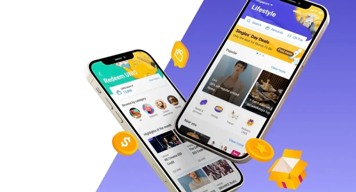
Rewards tailored to each user, not another generic rewards card, inside UOB's TMRW app.
The challenge
Rewards inside a banking app usually mean the same generic catalogue everyone else has. Inside TMRW, Singapore's first digital-only bank built for millennials, that would not move anyone. The bet was that personalization, not a bigger catalogue, was the differentiator.
The project
Make rewards feel genuinely tailored to each user, surface value earlier in the journey, and turn a commodity feature into a reason to open the app. I led research, design, and testing, and owned UAT with engineering end to end.
The brief assumed discoverability, that users couldn't find the rewards or understand how to redeem them. Discovery said otherwise. In guerrilla interviews, users weren't struggling to find rewards; they didn't trust the rewards were for them. TMRW read as another generic cashback card, the kind you ignore because nothing on the list is ever actually yours.
That reframing was the first real decision. We had been about to optimise discoverability. We stopped, and ran a three-day sprint with the stakeholders who would own the roadmap, mapping pain points, gains, and value together, so the new direction had buy-in built into the process, not presented after it.
Fixed the trust gap upstream
When the problem is relevance, a better-organised list of irrelevant offers is still irrelevant. The fix had to go upstream, into what got surfaced, not how. We partnered with Fave to personalise rewards on a user's real location and spending, so offers were tied to where people actually shop and what they actually buy. That was a product-direction decision, driven by the research, and it is why the interface work after it landed.
Personalisation broke the header, so we fixed both
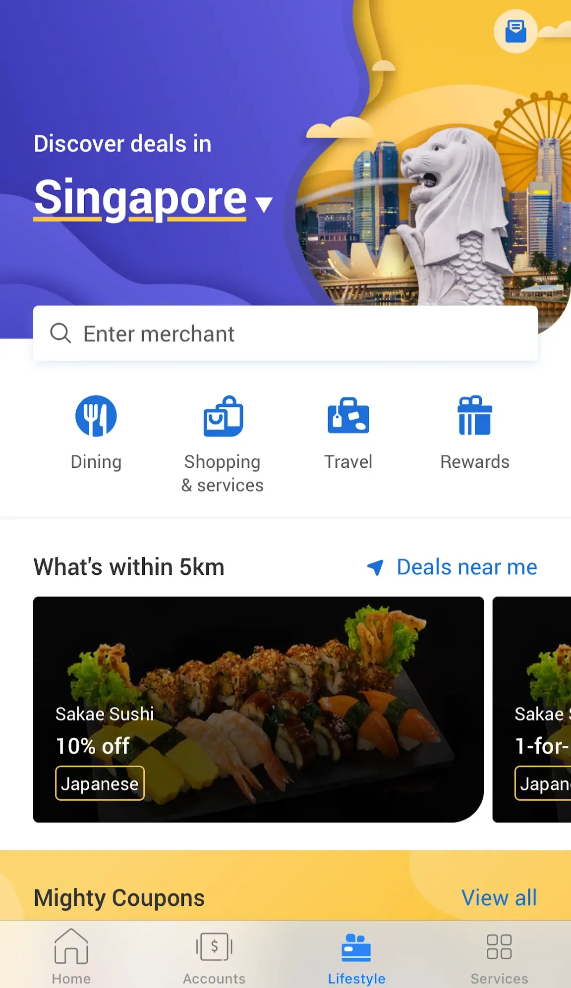
The new work brought new surfaces, a rewards wallet and a favourites section, and the old header had nowhere to put them. Adding them without rethinking structure would have buried the personalisation we had just built. We regrouped related actions, rewards, QR pay, search, so the header stayed legible, and consolidated scattered reward types into a single wallet, replacing the guesswork of tracking expiry and redemption across disconnected screens.
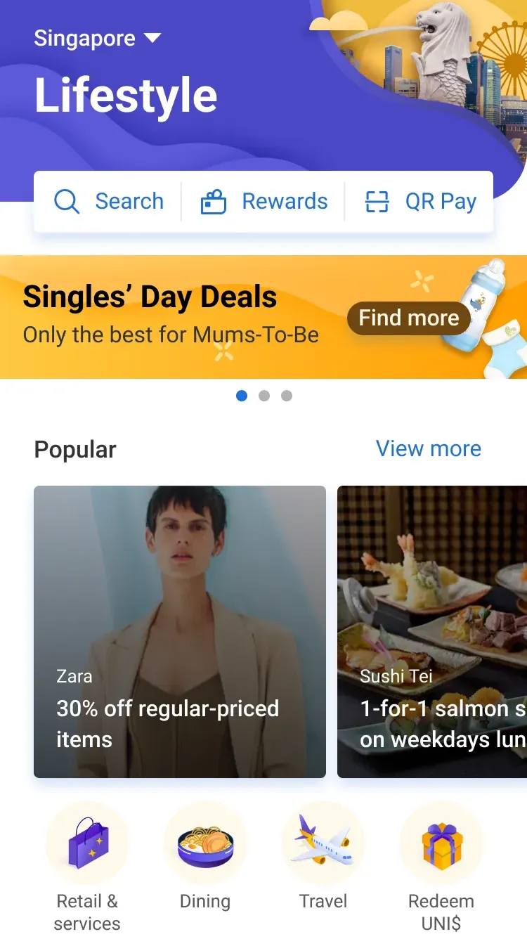
Lifestyle & Rewards launched with the Fave personalisation layer, the restructured header, and the unified wallet. I coordinated UAT with engineering so the personalisation behaved as designed for different users, not just visually. Built from the original brief, we would have shipped a tidier version of a product users still didn't trust. Unscripted five-minute conversations are what prevented that.
- UX DesignerEnd-to-end feature design
- Stakeholder managementWorkshop facilitation and alignment
- UAT testingCoordination with engineering through release